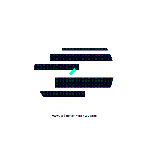

Initial sketches for this odd ball brand revolved around geometric shapes & right angles. The term made us think of digital lettering found in amplifier sets, cassettes from the eighties, and typography used by hip-hop record labels. Knowing the client’s musical influences also helped during the development. The final version is a combination of the first letters of each word along with the number 3. A neon variant of turquoise is used, contrasted with deep blue. The animation is electric, inspired by the glitches found on VHS tapes.