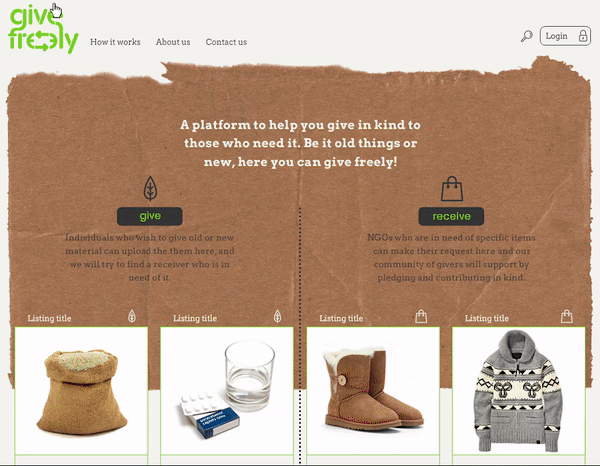
Our design premise, as we merged the letters ‘g’ and ‘f’, and connected the two ‘e(s)’, was to characterise the endless process of giving; a philosophy which is at the heart of the venture. This is a web platform built to help individuals give away material for free - for charity or for disaster relief. We were inspired by all things organic as we created supple arrows, stencilled, and stylised the typographic form. Apart from using clean iconography we utilised textures of cardboard, wood and leaves to make the web experience more cohesive.