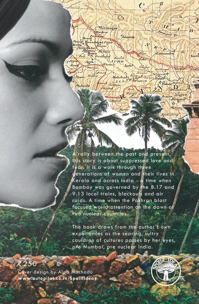

While the typography for this book is imagined as written by Kunjan, it leads into railway lines, hinting at the conflicts and crossroads that he, along with other pivotal characters face in their journey. The colourful imagery symbolises love, beauty and hope; whereas the greyscale/sepia tone with the tearing technique addresses issues such as fear, oppression, physical actions, and national chaos. The print edition features the deboss technique, which further emphasises the harsh drama and shows that even negativity has reason and hope.
