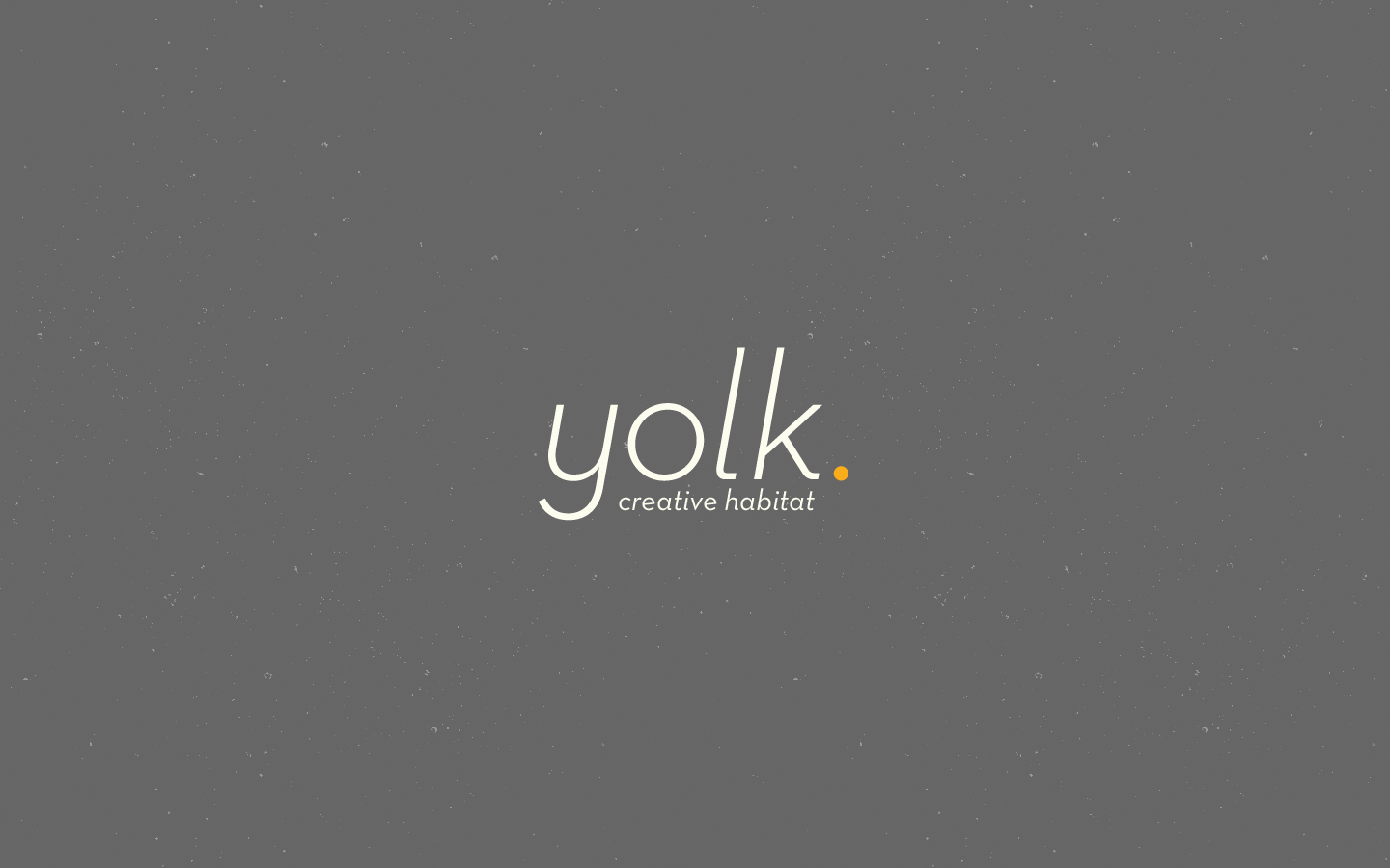

he new version of this identity is minimal. With its clean typography, the yellow full stop signifies how it all begins and ends at yolk, how ideas get their finish at the company. The simple 3 colour approach is subtle as it moves away from the earlier bulkier version which utilised the alphabet O to show the egg yolk. The textured background references concrete and recycled carton found in egg packaging, and the italics depict a sense of motion, showing the studio is always moving forward.